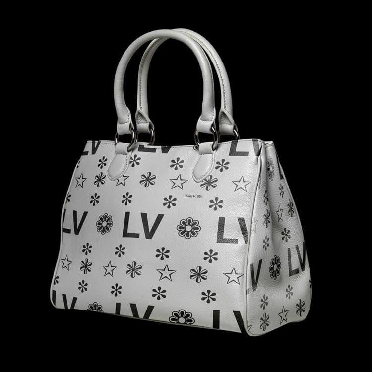
1. Louis Vuitton, Simple But Still Chic
The iconic Louis Vuitton bag is probably as well-known for its brown leather coloring as it is for its print, and both are wildly reimagined here by Gaur. The ‘LV’ logo print is a truly minimalist sans serif font, and the accompanying decorative stars are simply subtle additions. As for the color, the monochrome look offers an extreme departure from the Louis Vuitton accessory beloved by many across the world. Simple, but still glamorous.
2. Always Coca-Cola
The can of Coca-Cola is arguably the most recognizable beverage on the planet. Therefore, it’s fascinating to see this soda icon given such a drastic facelift, stripping away the elaborate font and washing out the bright red color we know so well. ‘Coca-Cola’ is such a powerful brand; however, it somehow remains recognizable with just the name adorned across the can, not relying on font type or brand colors to stand out from the crowd.
3. Simply Tropicana
There’s something extremely wholesome about Gaur’s ‘Tropicana.’ Cartons these days are so often covered in so much information and imagery, it’s hard to decipher what’s inside.T he simple logo, and humble orange split in two is the only design features, the rest of the carton kept free for essential dietary information.
4. Smokin’ Design
You can almost imagine Marlboro rebranding precisely like this, the simplicity of the design is very appealing on a small packet of cigarettes. Marlboro is the biggest name in tobacco, so why not just keep things simple and effective with the name front and center, nothing else. The only confusion with the monochromatic design is differentiating between the different types of cigarettes Marlboro offers, such as menthol and light.
5. Once You Pop...
Out of all these redesigns, this is the one we like the most. Much like the crisps inside, the simplicity on the side of this legendary tin is addictive! This is what we imagine Pringles would look like in the 1950s, and they could do worse than going back in time with this design.
6. Very Fresh
Gaur has given Subway a slick new logo here, which looks like a line of code. With the green and yellow gone, the name and the offering take pride of place on the packaging, and it’s very useful. Like many on this list, we genuinely prefer this dystopian take to the current design.
7. Retro Chanel
What’s interesting about this one is that Chanel No.5, as we know, is recognizable for the color of its product rather than the packaging. It’s sold in a glass bottle, with the gold perfume inside, providing a significant impact. Here, Gaur packages the fragrance in what looks like a metallic container, giving the consumer no clue as to the color of the iconic product inside. It’s retro-chic, but not really luxe as Chanel intended.


